There were two reasons I was excited to receive my March House Beautiful in the mail yesterday. First of all, I usually receive my US subscriptions weeks after they have been on the newsstands, so to receive a March issue in January made me smile. The second reason was the issue was all about the colour BLUE, which is a favourite colour to use when decorating not just my own home, but clients’ homes as well. Erin of House of Turquoise gets a mention in editor in chief Stephen Drucker’s column. Way to go Erin!
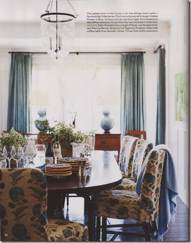
I love the use of blue in this dining room especially the slipcover fabric on the chairs – Jasper’s Indian Flower in Blue.
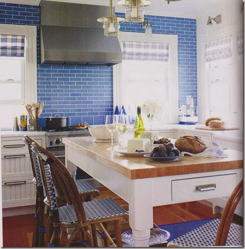
Gorgeous glass tile described by designer Marshall Watson as “periwinkle verging on cobalt.” It’s a kitchen in Fire Island, New York which is 5 miles out in the ocean so careful consideration had to be given to the building materials. For example, the walls are all wood (not drywall) which breathes and bends in a storm. That’s what I love about this magazine – the insight from designers as to the design choices they made.
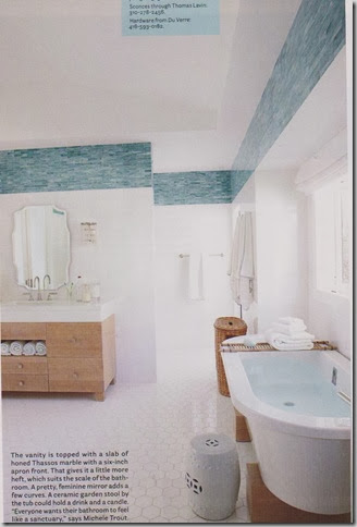
Great idea – 1” x 6” blue glass tiles lining the perimeter of the bathroom near the ceiling. Love the mix with the 12” square wall tiles and the hexagon floor tiles.
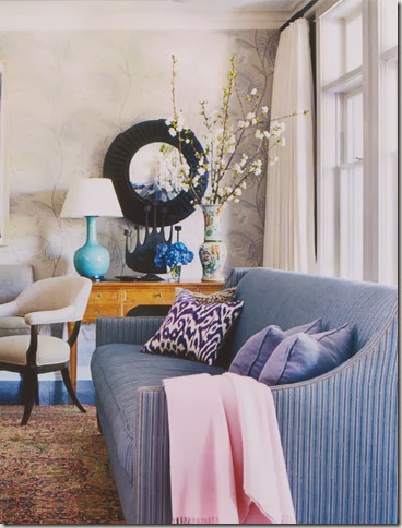
This room has three things I love – round mirrors, branches and subtle wallpaper (see earlier posts).
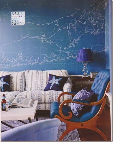
Although I don’t think I would personally do a patterned sofa and rug, there’s something about this room that says come on in, sit and stay a while. An artist painted the nautical chart of Long Island in the “map room” – how unique is that?
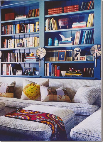
I love the bookcase painted in Farrow and Ball’s Down Pipe which looks very gray on the paint chip but quite blue in this photo.
Now that I have done yellow and blue posts, I think red will be next, don’t you?
0 comments:
Post a Comment